93%
adoption rate in products
developed with React
40%
faster development
time
35%
reductions in design
and development costs
Phases and toolkit items used

Component build

Token architecture

Creative strategy & positioning

Audit & planning

Accessibility

Roadmap & strategy

User research

Qualitative research
The Brief
Client
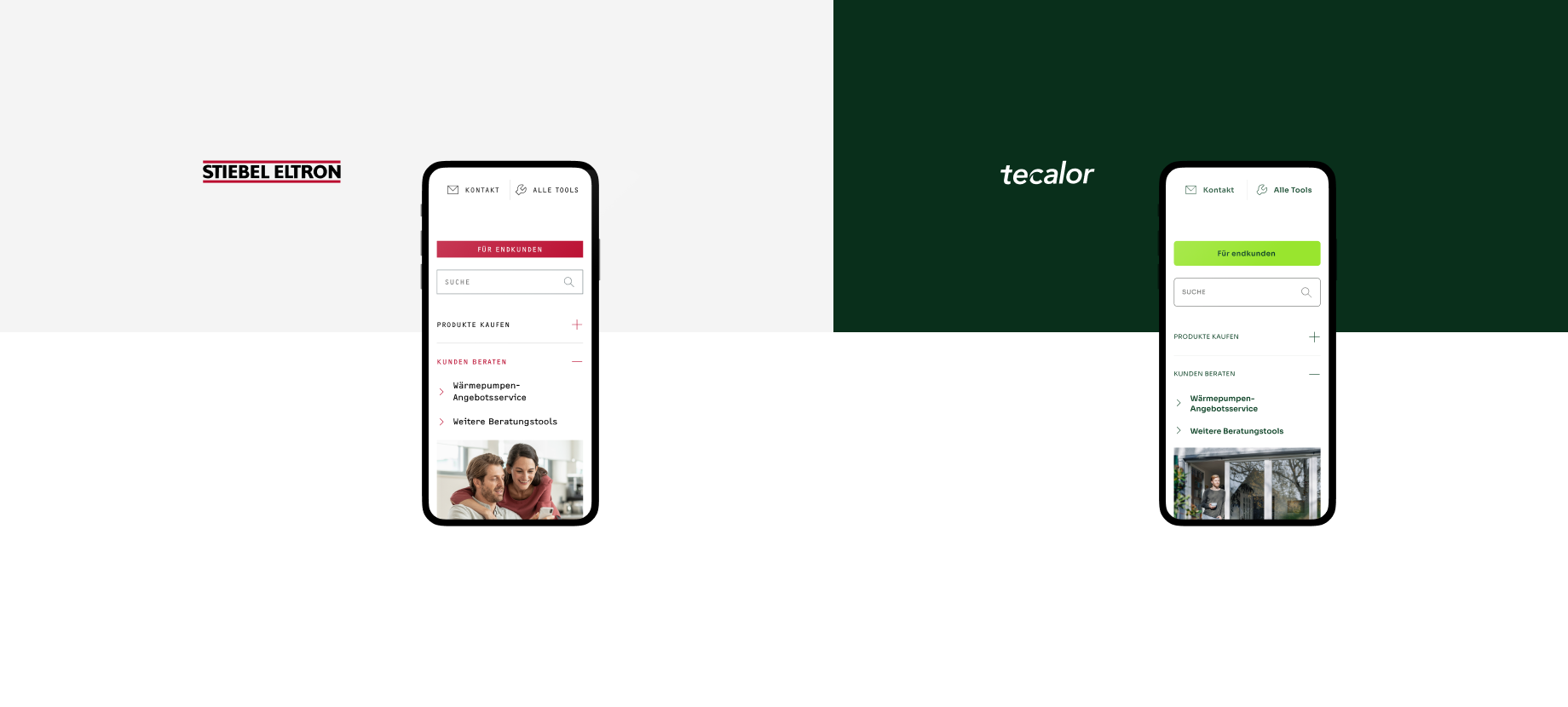
Stiebel Eltron
look at Tecalor's ecommerce pageOverview
Stiebel Eltron is the leading manufacturers of heating and hot water solutions. One of their heat pump brand, Tecalor, provides smart heating solutions. With the growing focus on sustainable energy solutions, they wanted relaunch their minor brand Tecalor.
They chose to integrate it within their overarching brand, deviating from the Interact-specific approach. This called for a reshape of the Stiebel Eltron design system. It needed to seamlessly accommodate both Stiebel Eltron and Tecalor branded products, which involves preserving core elements while meeting the unique visual and experiential
My Role & Contributions
As the Design Engineer, my responsibilities encompassed:
Strategy:
- Developing a multibrand design system strategy that maintains brand individuality while sharing core components
- Creating a unified design language that accommodates both brands' unique visual identities
- Establishing guidelines for component variations that respect each brand's color schemes and styling preferences
Design and Implementation:
- Building a flexible component library that adapts to each brand's visual language while maintaining consistency in functionality
- Implementing a token-based design system that allows for brand-specific theming while sharing core structural elements
- Creating documentation that clearly outlines usage guidelines for both brands
Collaboration:
- Working closely with both brand teams to ensure their needs were met
- Coordinating with developers to implement the system efficiently across both platforms
- Training team members on the new design system
The Challenge
First, the Stiebel Eltron brand was not optimized for digital products, making it difficult to achieve accessible contrast levels and appropriate typography. Second, integrating the new product into the existing design system while maintaining brand consistency added complexity and increased maintenance costs.
Although many components from the existing portfolio could be reused, the new product required seamless integration of custom components tailored to its unique needs. To ensure long-term scalability, I focused on building a sustainable design system capable of supporting future brands and evolving requirements.
The Process
Audit
It started with a comprehensive audit of both brands' existing digital products, identifying common patterns and unique elements. This helped understanding where components could be standardize and where brand-specific variations need mantaining.
- Core components that could be shared across both brands
- Brand-specific elements that needed to be maintained
- Technical requirements for implementation

Phased approach
A 2 phased approach was adopted to address the challenge. There's 2 key objectives:
- The most important objective was for the new product team to start designing promptly with minimal delays.
- The second was to optimise the Tecalor branding for digital products to have a temporary library, containing a core subset of the components to enable the design team to start using it.


Design & Development
Transitioning to the second phase, the strategic choice was to facilitate the team's implementation of the library, gather input, and finalise the branding. With these elements in place, the priority shifted toward our ultimate objective: crafting a sustainable solution. Its ultimate goal: remain agile by minimising the additional manual labor and added complexity of multiple brands.
To achieve this, the primary focus was on replacing the standard design styles with design tokens. Tokens allow establishing a shared logic for applying styles across multiple brands – only modifying some core values for each brand. The reason this works is the inherent layering of design tokens, with each layer building upon the previous one in a parent-child relationship. In essence, the initial layer encapsulates brand decisions, and the subsequent layers determine where and how these decisions are applied.
This modular approach resolved the immediate challenge at hand whilst streamlining maintenance, providing flexibility, and enhancing overall consistency.


Implementation and Adoption
By creating a white-label library that contains all components, and removing brand-specific components from the Stiebel Eltron & Tecalor libraries, the design system is ensured to remain aligned yet unique for each brand.
It's even designed to accommodate any future brands. This can help the client effectively venture into new products with increased speed and quality, while maintaining consistency and leveraging lessons learned from other brands and products. This empowers them to deliver a better product experience and reduces the cost of design and development.

Reflection & Learnings
Key lessons learned:
- Balance is crucial: Finding the right balance between shared components and brand-specific elements is key to a successful multibrand system.
- Flexibility through architecture: A well-structured component architecture can accommodate visual differences while maintaining functional consistency.
- Communication is key: Regular alignment with both brand teams ensures the system meets everyone's needs.