
My Role & Contributions
As Product Designer, my responsibilities encompassed:
Design and Problem-Solving:
- Developed user flows and wireframes based on validated research.
- Made critical decisions on organizational principles, advocating for a user-centric approach.
- Demonstrated how integrating projects could simplify the user experience and improve feature utilization.
Challenges Overcome:
- Navigated shifting business priorities
- Facilitated stakeholder feedback sessions, ensuring everyone's perspectives were considered.
- Presented design & design processes from start to end of project to leadership, influencing key decisions.
The Before
The main challenge was to create a distinct visual identity for Tecalor while maintaining the efficiency and consistency benefits of sharing a design system with Stiebel Eltron. We needed to ensure that both brands could maintain their unique market positions while sharing core components and patterns.
Additionally, we needed to optimize the brand for digital products while ensuring accessibility and maintaining visual appeal. This required careful consideration of color contrast, typography, and interactive elements.


The Brand Refresh
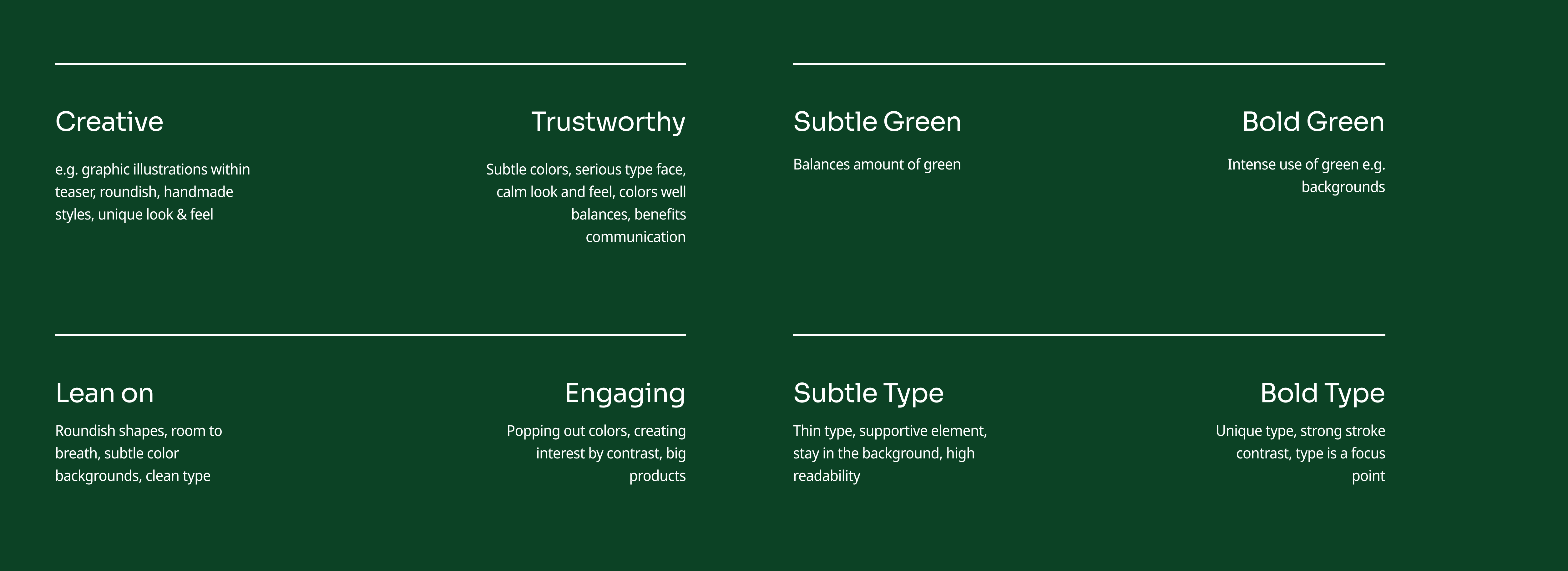
Exploration axis
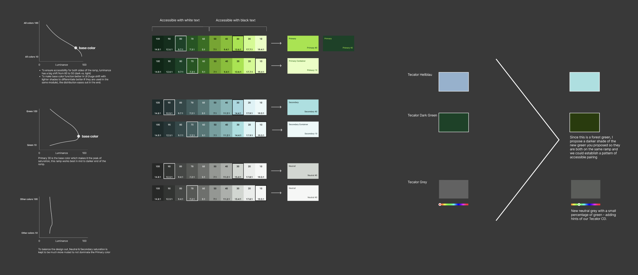
Systematic colors building
To enhance the brand's digital experience, I create scalable, systematic contrast steps color ramps for design team to leverage brand elements. This gives structure to the colors for scalability and assist clients converting from print style guide.
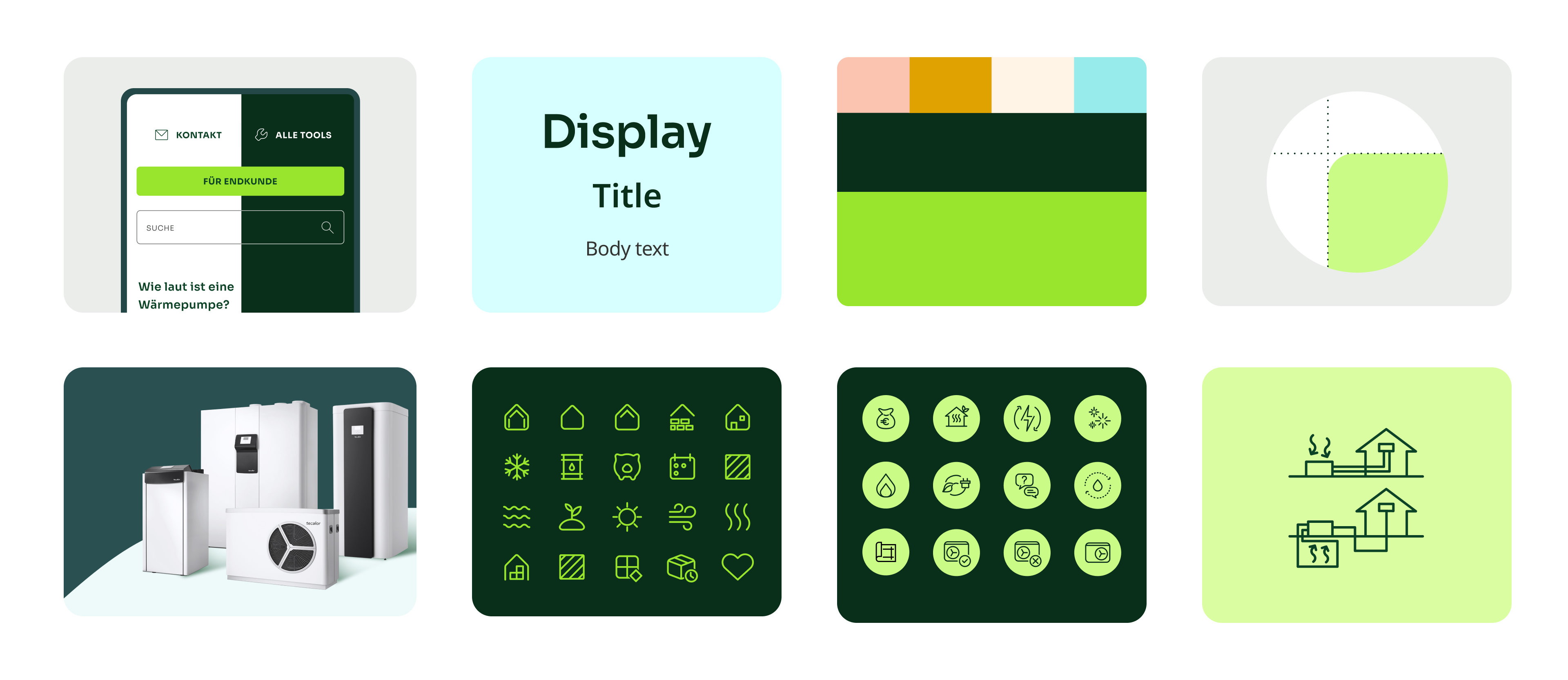
Product Exploration
The exploration process involved developing foundational concepts and testing their adaptability across the entire system. Initial design directions provided a starting point, but translating them into a cohesive experience required deeper iteration. Rather than applying surface-level changes, the focus was on refining and expanding the design language to ensure consistency and scalability across all touchpoints.


Systemizing The Refresh
Integration
To maintain harmony across the system, work was shared regularly to assess balance and cohesion. The design continuously evolved through iterative testing within the product UI, with ongoing collaboration and feedback from product teams.

Updating The System
Once the system was fully aligned, core libraries were refactored, and changes were systematically migrated with the help of the Token Studio plugin. Alongside refreshed components, the new library introduced foundational elements, including illustrations, icons, color, typography, and spacing, ensuring consistency and scalability.

Reflection & Learnings
Key Lessons Learned:
This project underscored the significance of a user-centered design approach and the impact of iterative development driven by real user feedback. It emphasized the need to align business goals with user needs to create a product that offers meaningful value.
For Homeowners and Customers:
- A more intuitive and visually cohesive website, making it easier to explore and compare heating solutions.
- Improved access to product details, cost breakdowns, and financing options for informed decision-making.
- A seamless e-commerce experience, simplifying the process of purchasing energy-efficient heating systems.
For Installers and Industry Professionals:
- Streamlined navigation for quicker access to technical specifications and installation resources.
- Enhanced clarity in product categorization, reducing time spent searching for the right solutions.
- A modernized design system that ensures consistency across all digital touchpoints, improving overall usability.